03/11/2023 Website Analysis
3 Good Websites:
Amazon Website

Amazon is a shopping website where you can order everything from every category you want. On the home page, you can see all or at least most of the categories of the products. which are in separate boxes. It also has other classifications of the products for example suggestions of products according the previous searches, for men, women, and kids or new products from trusted brands.
Also, the navigation bar at the top of the page helps to find the categories better and easily.

sliding in the menu also helps to navigate and search better through the site.

Different sizes of boxes and different shapes of the boxes help to get the audience's attention and not get boring. Bright colours and some advertisement banners in between get the attention of the audience and help them see them clearly.

in the Women's category, you can find the products according to your search. On the left-hand side, it has a filter bar so that you can filter the products and get precise results.

In the product page, it gives the audience the details of the product and the price. It also shows the product picture on different sides so that you can have a better view of this. Under the product details, you can see two bars that suggest the related products on the same product in different shapes or brands and one for the products that people buy with it.

It is easy to find the add-to-basket button and add it to the basket for buying it. it also has an add-to list so you can add it to a specific list to buy them later.
McLaren Automotive Website

https://cars.mclaren.com/gb-en
The colour of the orange car and black background catches my eyes as the time I open the website.

The navigation bar easy to find what kind of car you want you can see the picture of the car and each category. Using the hover helps me whatever u want to go.

This is the bar menus that help me to find all the pages of the website. The contrast of the text menus and the colour of the background of menus makes the texts easier to read. you can select the other languages and read the text in other languages. you have different sub-categories which help me find the pages you want easier.

When the pointer of the mouse goes to the next section of the site it changes to a circle which has a drag text inside which shows you that you should drag in this section.
Netflix Website

Netflix a website where you can watch unlimited films, TV programmes and much, much more. You can watch where ever you are on your phone, tablet, laptop and TV it is all steamed umlimited films and TV. You can create different profiles for whole famliy, for example children you can spend them on adventures with their favourite characters and they can enjoy. you can also download programmes or films and watch at your lesiure on the plane, train, or the car. The beauty of Neflix is that you can even watch on playstation, xbox, Apple TV and many more.
These are some of the films you can watch on netflixs, they range from Horror to family films.


3 bad websites:
Pacific Northwest x-ray inc. website

This website is not good design, because it doesn't tell you much about their products apart from the name, no descrition or prices unitl you go on the product that you want. You would have to know about the products before hand, would need to ring the company. You can hardly see the writing, and had no link at the top of their web page for customers to go and browse.
Lingscars website

This website is bad website, because it crowded full of image, too many colours, too much information and some animations which makes it far more crowded. It has empty space at the end of the page which makes the home page too long and we should scroll too many timed to get the end of the home page.
It doesn't have a navigation bar or menu for going to the category of products. It doesn't have any category for products.

This is not a good website, because it doesn't have a navigation bar or link, also it doesn't have enough pictures and not enough information about products. It doesn't have any titles and it doesn't have bold items.
4/12/2023
Secondary research similar websites

https://www.limitlesstravel.org/disabled-holidays/categories/short-breaks


17/11/2023
key coding Terminology
WWW-World Wide Web
The World Wide Web is a webpage found on this global network of computers where the public can access different websites or pages on their laptop of computer.
before the World Wide Web there was the internet this was developed in the 60's, so there is a difference between the two, so the internet is a source of communication network having continuous communication,then in the 1990's The World Wide Web began, so the internet is all of the Hardware, all cables for the computers and satellitesand modems this is all th internet.WWW runs on the internet.
1) World Wide Web was founded by a man called Tim Berners-Lee he invented the world wide web (WWW) in the year 1989 he was the father of the WWW, this was created while he was working for a company called CERN.
2) CERN was where Tim Bernes-Lee had an idea for Hyper text in the year 1980 this is where you click on a document and it takes you to a different document, this is the lauguage used on the WWW. In the year 1989 his first proposal was written and then in 1990 he wrote a second proposal. This was also the year for Hypertext Transfer protocol and Hypertext mark-up, and his first browser and first web server.
3) 1991 was the year www was switched on outside of CERN,then came yahoo in the year 1996 and facebook in the year 2005.
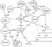
Tim berners- lee first proposal
HTML- HyperText Markup Language
HTML stands for Hyper Text Markup Langauge. HTML is a standard markup Language for creating web page, it describes the stucture of web page, also consits of a series of element. HTML elements tell the brower how to display the content.

HTTP-HyperText Transfer Protocol
HTTP ( Hyper Transfer Protocol) also know as the World Wide Web would not exist-without HTTP, this enables the transfer of data over the internet, allowing users to access websites and other online resources. Also is a set of rules for transferring files such as text, images, sound, video and other multimedia files over the web.

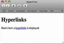
Hyper Links
HyperLink they create links, or connections, between pages.This allows us to nivgate quickly and easily from one webpage to another. A hyperlink, also called a link or web link, contains an address for a destination and acts as a reference to data, it can be a piece of text, an image, an icon or a graphic that when you click on it it takes you to a different webpage or document.
CSS
CSS- stands for cascading style sheets is a style sheet Language used for describing the presentation of a document written in a markup language such as HTML or XML. CSS is a conerstone technology of the World Wide Web alongside HTML.

.jpg)
Significant Hardware Developments
The significant Hardware Developments are opportunities for upcomming products are huge from end-to end developments of hardware systems is an intricate project in itself.Despite the fact that IOT systems have Hardware,firmware and software components of which is 80% of the cost and development is owned by the embedded system hardware and firmware.
There are seven steps for this and they are the following:
1) Process autiomation and virtualization.
2) The future of connectivity.
3) Disributed infrastucture
4) Next generation computing.
5)Applied Artificail Itelligence (AI)
6) Future of programming.
7) Trust architecture.

This is web development timeline of
Example of software used for web development

Different Types of websites and when they were developed with examples
Different Browsers


google websiste 1989
Google has its origins in '' BackRub'', a research project that was begun in 1996 by Larry Page and Sergey Brin when they were both phD students at Stanford university in Stanford California.Search engine have been around for a longtime,but it is google that everyone goes on to find just about anything and everthing on the World Wide Web.The site was named after googol:- the name for the number1 followed by 100 zeros-this was found in the book Mathematics and the Imagination by Edward Kasher and James Newman.

ebay website
Ebay was launched by French-born Iranian-American computer programmer, ebay is a gobal online auction and trading company which was launched in the year 1995. Ebay was one of the first companies to creates a market an internet website to match buyers and sellers of good and services.ebay is headquarters ins in San Jose, California.The first item sold on the site was a broken laser pointer by a man named Mark Fraser.

yahoo! website
Yahoo! was found in January 1994 by Jerry Yang and David Filo, both graduate students at Stanford university in California, and was incorporated on March 2 1995 when a Search engine was added. In 1994 The Yahoo! home page was a directory. It was globally known for web portal, Search engine yahoo! and many related services such as yahoo Directory, yahoo! mail, Yahoo news, Finance any many more. Yahoo was one of the pioneers of the early internet era in1990s.


Nike,Inc. In American sportwear company, one that is the world's best known brands. It was founded in 1964 as Blue Ribbon Sports by Phil Knight and Bill Bowerman. In 1971 the company was renamedas Nike, Inc and went Public in 1980. By the early 21st century Nike had retail outlets and distributors in more then 170 countries with logo- a curved checked mark called the 'Swoosh' was recognised world wide. The company headquarters is in Beaverton,Oregon."The Nike " is correctly pronounced as "ny-kee" the name comes from the Greek goggdes of victory.The slogan "just do it" is also regognized all over the wolrld.
20/11/2023


This is my brain storming about

This is my Travelling for Disabled people on Canva for framework for site.


27/11/2023
Planning a research


This is my planning research for website to get some ideas of what I want to put on my own website on the wix.com.
24/11/2023
Planning for website
.png)
.png)
This is style planning for website pages and where the picture will be, the text box will be also the buttons and contacts navigation bar. The style of my blog page.
I decided what images I wanted to put in my website.
.png)
.png)
.png)
.png)
.png)
.png)
27/11/2023
html and Css

Researching and planning
4/11/2023
This is my planning that i did with Annette, yashmin and i have done some of it my teacher said that i did with some with Annette and jollea


UX and UI design
04/12/2023

UX and UI both fall under the same umbrella in web design, experct UX which refers to User's journey when interacting with a product or service. UX design is the process when you create products or services that provide meaningful experience for the users, this involves many different are of product development which are:- branding, usability, Function and design.
Another way of UX deisgn to consider is how the user introduced to the service or product though advertising, blog, or anything else. The primary goal for a UX designer is to make sure for each user to have a postive interaction with the product or service, this includes solving problems to finding critical information. The experience should Leave the user feeling happy.

UI is short for inferface design, this refers to the layout and visual appearance of digital application for example from a website to a mobile app. The look and feel an application together with the visual makes it much easier and delightful for people to use.
A good UI design will mean that the user has understood how to go about each step when interacting with an app or website. The UI contains a screen which a user navigates through while using an app also something they might type in and every menu a user accesses.
UI has the components which make up most interfaces, each and every componment has a purpose, here are some of the most UI componments:-
(1) Button
(2) Radio Button
(3) Tool bar
(4) Text field
(5) Check box
(6) Message box
(7) Slider
(8) Toggle
(9) Tabs
(10) Icon
All the above componments are put in four main categories which are:
(1) Iput control- this includes Checkboxes button, toggle, text field, and date field
(2) Navigation elements:-this includes breadcrumbs,slider,search field and tags.
(3) Informational components:- this includes Tooltips,progress bar,notification and message boxes.
(4) Containers:- this is a list od items that utilizes show/hide a fuction.(accordion).
Users need to understan what each of the above components do on a website,so that when they do a search field this will help them navigate a website and an input field is where they type the information.
UI design has visual points where the user interacts with a site and focuses on what a person sees and interacts with visually in order to use a website.
Difference between UX and UI is that UX can only be applied to non-digital products or services where as UI is always applied to a digital interface.
.jpg)
.jpg)
Best practices for mobile app design
Best practices for mobile app:- Simplicity and clarity, this help you increase engagement and drive conversions
Designing a mobile app there are file elements to this they are following:-
(1) competitor research:- see which other apps are out there the sene the same purpose
(2) choose the night platform:- for example ios, Androld or both
(3) Wireframe:- create a visual representation of how you want your help to look and function
(4) Find the team:- Make sure you have a team that you can trust to build your product
(5) Measure your succes: Track your app's download numbers and user engagement
(1) Make use of geatures:- There are a few things to keep in mind when designing your mobile app:- the few are as follows
1) pinching:- this is used to zoom in or out of a photo or map
2)Swiping:- This is used to scoll through a list or move between screens.
3)Tapping:- this is used to open a link or select an option
4) Finger movement:- this is used to scroll through a web page
2) Be Mindful of notifications:- These are a good way of keeping users updated on your app from news, features, and updates
Below are just a few examples of notification that can be used in your app:-
(1) A notification about a new feature or update
(2) A notification reminding the user of an upcoming event
(3) A notification with information abut a sale or promotion
(4) A notification letting the user know they have a message or voice mail
(3) Maintain Component and design Consistency:-This is vital as your users should be able to navigate your app very quickly and know where they are in the app at all the time.
Make sure you maintain a consistent design all threw your app is making sure that the same colour scheme, typography, and icongraphy are usedin your mobile app,making sure that the buttons,controls and other elements are on the screen.
(4) Simplify Onboarding:- This is essentail because your user needs to be guided ouickly and easily otherwise they will lose interest,also reduce the nuber of steps required to start and making sure each step is clear.Visuals should be less as this can be overwhelming.
(5) Focus on content:- your app's content has to be more important than your design because if the user can't find what they are looking for or can't undstand how to use your app they will go somewhere else.
(6) Keep an Eye on UI noise:- here are a few ways to reduce this ;-
(1) use fewer colours
(2) use simple and clean shapes
(3) use typograhy
(4) use animations sparingly.
(7) Optimize your App for poor connectivity:- below are a few things that you can do
- use small file sizes eg:- images,vidoes and audio files.
-Make sure your app can work in offline mode.
-Use data compression to reduce the amount of data.
-Test your app in areas with poor connectivity.
(8) Optimize user flow:- This is one of the most important thing when designing your mobile app,as the user would like things done in a few steps as possible.using visual is good to guide the user through your app by using arrows or any other visual elements that help the user where they need to go next.

06/12/2023
XD and app

Screen recording to show my interaction I used the XD app I used the design mode to create the pages and add the image and also made the images round.and I used the prototype to drag the next one and the other one and i used the preview to show my interaction.
Screen recording to show my interaction
13/12/20123
planning my own application


.png)
.png) this is my sketch for my applications for my final app
this is my sketch for my applications for my final app


feedback back for usability testing


24//01/2024


 This is the peer feedback I got from 3 classmates. For the first question I got which is that the information is very useful and navigation bar is very easy to and useful because of the pictures. For the second question that I have for my app is simple to use and easy. The third question is that I used the proper colour scheme. The fourth questions is that I could add a sign in page on tne map or navigations bar 5. I get the imformation from them and then I have provided from them.
This is my first time doing Adobe After Effects on my own to try out so I followed the demo today to try out different things so I did all my own

I talk about my users, what they need and how they can travel. I understood that they need facilities - buying tickets- via service-booking accommodation [ Hotel camp] get guide & help-booking taxi -tour
my application is to provide some accessible tours for disabled people.
First to find a location for example Germany, then you select it from the application suggested tours then see the explaination of the accessible tours and then select one of the tours. Explain the need and select services, facilities to book the tours and checkout. Then the notification for the date/payment service informs you about the important dates and times of your selected tour.
I decided to plan for Travelling around for disabled people
moodboard for application
15/12/2023
Reasearch for mobile app

There are just some of must have app on mobile phone for disability ranging from screen reader to voice recognitio, also for visual and hearing impairment, visual appearance is very bright and has different colours for each app. The app is definately easy for people who havea disability and they can navigate what they want. I have taken ideas from this app to put on my app, but would change and make it more colourful with many different destination and more accessible, I would put them all on the same page as this will be easy for the user.

18/12/2023
Passenger assistance app
This app helps people to book train ticket and it helps to find accesible stations and reques services according to their disability.
it has some options to select from to help people to define their disabilities in an easy way.
in ths app it has change the colour theme perfect for people with sight or reading difficulties like people with colour blindness or dyselexia.
This app also has some options foe needed services during the trip or in the station.
for my own app i need same options for people to select the disabilities and the services they need for their trip.
Accessible places- Accessibil Application
this app is for people to find accessible places to go it is mostly based on people opinions and reports about the places and what accessible tools are available there.
people can rate the places by giving them stars.
in the area people can filter the places and get the suggestions accordingly.
by selecting a place on the map the users can have access to its details, routes and they can evaluate the place.
in the place details people have access to the information of facilities and services which are available there.
There are several questions for you to answer for evaluatng the place to give a better insight of th place to others.
You can also find tha route from your location to the place which had been selected
The places are marked by signs and colours to show better the most accessible places.
for my app iwould use evaluation method of this app for my tours and also use the place details and showing them on map with colours and signs would help people to find more accessible places to go.
Viator: tours and tickets App
this app is about booking tours and tickets.
You can search where ever you want to go.
You can find the locaction on map.
selecting different tours and attractions.
later travels and wishlist fofutire plannings.
search tours by locations.
booking tickets and tools and revices digital tickets.
for my app i need search bar to find the tours according to the location, Map and locations, booking tickets and giving digital tickets.
.png)
.png)
27/12/2023
final website and Usability testing


website evaluation
This is the wix.com website that is getting around for people who have a disability, the website can help them to find out how they can travel. I made it using the wix.com website that I used last year.
If I were to repeat the process again, I would do it differently, like keeping the same background colour and adding more videos of myself and other stuff that I can change differently next time. I just got the feedback from 4 other classmates so I should change it next time if I want to repeat using the feedback I get. I was planning a research on the paper and also did a presentation, and then I used Canva to plan it as well.
What I did well is do to Wix.com again as last year but doing about travelling with a disability getting around I did try my best to add more pictures and videos that I took the picture when I travelled so many places that I been to so yeah it my own picture that I took from my phone for my Wix.com website and knew to add the stuff to the website next time and also add the same colour for the background.
Overall it was alright but a little hard, when I did the website I actually didn't know which template page to go with for the topic that I chose.
I have learned how to create products and blog websites, also I didn't know how to put the pictures in the boxes with the labels in it.
So then I got to learn how to put the picture in the boxes. Also for my logo, I didn't know how to put all my pictures on the website homepage.
So yeah then I got to learn how to put my logo on the website homepage. But I know how to upload the picture and the text box to write how I have been travelling on about me, Travel, Eat and Relax page.


This is my feedback from my class friends for usability testing
This is my results that I asked 4 people to do my feedback and I should add my own changes if I should do differently and add a few bits on my websites and some of the feedback I got is that I should make my own changes next time if I want to repeat again and the feedback I got is they like my website. So I understand the feedback from my classmates and also I should make changes for my websites if i want to do my website again in the futture for the the next time.
I understand that I got feedback from them and on my website I should add some videos, add colours to the background, less Less informations on homepage, add paragraph in text, stick with one colour scheme put more binteries and I should add my own social media.
12/01/2024
final application design
https://xd.adobe.com/view/33551c80-6a34-42ca-9f85-0704b509eb69-6606/
24//01/2024
app evaluation
my app is getting around for people who have a disability, from the app it can help them to find out how they can travel. I made it using Adobe XD software by following the demo also for the Prototype is that I joined the different boxes for different buttons the text boxes, and for the design.
I found the photos and the buttons hard because I never used the XD app and also photo buttons are important because to show how the app works and for the photos is okay for me to add in the app but for the photo is that I find it hard to put the picture in the repeat grid and also for buttons I find it hard to but the symbol in the navigations bar and other designs that I used that I find it hard to add things in the app.
I made different screens for different pages and also for the pages I used is one for maps, towns different accessories for where people should know. So I have planned it by sketching the ideas on the paper.
The difficult thing is that I did not know how to use the app before so I found hard is trying to put the picture and the text boxes in a repeat grip and I also went well is following the demo and adding the picture and it very interesting to learn the adobe XD for the first time and I had a little help from my ta assistance then I open the PowerPoint then record the app also click on the app button then safe it on the file then put on the blog.
I didn't know how to use the XD app before so this is my first time of using the app. So I have learned how to do the XD app. I didn't know where to start planning the ideas for my XD app. but now I have to learn how to put the picture on the repeated grid.
usability test form
Usability test

29/01/2024
Adobe After Effect
This is my first time doing my Adobe After Effects to try out and do some experiments on it so I did it to try out but


No comments:
Post a Comment