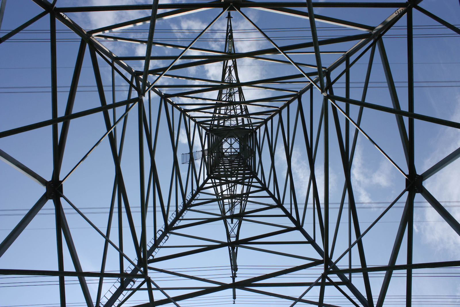
Composition photography:
the long shot angle
A long shot is a camera shot that shows the whole person from the top of the head to the bottom of your toes and it shows the relationship between the characters and the places where they have taken the shot.
the close-up
A close-up shot is when you take a picture of an object or subject at close range that shows great detail. it can highlight a particular detail such as an actor's face or an important feature. It is a way films tell their audience visually that this is important This shot is taken directly overhead with a detailed view of a person or object.
medium shot angle
medium shot is a camera shot taken in TV or film from the waist up, this shot shows attention to both the character and the surroundings where the picture is taken.
The high angle
high angle shot in filming is taken from up above making the subject small. This is when you see someone or something from high above.
the low angle
low angle is when the camera is below eye level, near the ground but it is aimed upwards so you can really see the subject. These shots make the picture seem larger, wider, taller, and closer.
Bird eye view

the dutch angle
is where the camera is tilted to the side slightly, the Dutch angle is as if it viewer tilts their head to one side of the other.
eye level angle

eye level angle is when you position the camera directly at the object or persons you are taking the picture of. this makes it like you are capturing the scene of the film or TV.
worm eye view
- the shot is captured from a very low angle and the carmera pointing toward the top. It's like what a worms eye would see, as the name says.
13/09/2023. Poster of Ryszard kaja using illusratrator
This is the poster of Ryszard Kaja's work that he has created. Ryszard kaja was a painter, poster,artist, stage designer, and costume designer from Poland. Rysard Kaja was born 16th January 1962 and died 17 April 2019 at the age of 57. He studied at the Acadmey of fine arts in pozand in 1984, he got a degree in painting under Norbet Skupniewicz. Both of his parents were artist his father was a poster designer and his mother was a ceramicst and painter. He designed over 160 posters, entitled 'poland' between 2012 and 2019, this is made him famous and popular.He had an outstanding talent for his generation.
I choose this picture because it shows the incrediable painting he has done in black and white with the detail of the moon against the dark night.he has captured the monument really well looks like a tower with poles on the side.
I like this painting of his as it is different and he has shown the creative way the face can be drawn, even if one is upside down, i also like the way he has captured the hair and the colour making it look natural.
I picked the picture that liked from Ryszard Kaja artist because it very simple to draw and i found it very interesting and easy to make it my own so it now stands out.
The process to change the picture to make it my own I used illustratror to create the picture which i copied on to illustratror ,i used different kinds of tool which were the Pen,Brush and text , layers, shapes and gradient colour and straight lines to join the shape that i wanted to create the picture that.I changed the background colour from a dark blue to a olive green colour and gave the writing some definition.I am very happy with the success of the picture i have created and the progress in which i used.
13/09/2023 practice photoshop
Soft arm chair, stool chair or garden chair
This is example of the the photo that i got from internet
for my photoshop that i am going to add to to make it different.
14/09/2023 exposure stimulator/practice
1. This was shot with stutter priority mode, shutter speed 1/60, aperture f/8, and iso 50.
This image is noisy as it is grainy and the depth of field is low as I can see the subject clearly.
Soft- blurry, noisy - grainy, overexposed - very white, underexposes, - black
2. This was shot with aperture mode, FF stop/aperture speed v2.8, shutter speed 1/2000 and iso is 200.
This image is soft in background and the depth of field is low so I can see only see the subject and nothing else.
3. This was shot with Manual mode,shutter speed is 1/30, Aperture speed is f/11, iso is 60.
The image is soft and so i can see the image clearly and the background is blurry and a bit grainy, making the depth of field mid.
4. This was shot with shutter priority mode, shutter mode is 1/250, aperture is f/22, iso 1600.The image is grainy and not clear as the capture is focused on the image itself and not the background.The depth of field is not very focused.
5. This was shot with Aperture priorty mode, shutter mode is 1/2, aperture mode is f/64, iso mode is 50. The image is very clear both in the bacground and the subject itself as you can see the trees and the fence and the table ,focuses is on the subject which is very clear.
6. This is Manual priority mode, shutter mode is 1/60, aperture mode is f/8, iso is 50, the image is blurry and grainy in the background and depth of field is low making the subject very clear to see.
Definition 16/09/2023
Definition of ISO Stand for Internationl Organization for Standardization this represents the sensitivity of light as a numerical value. A higher number has a higher sensitivity to capture light.
Definition of shutter speed : is the speed at which the shutter closes. Faster shutter speeds create a shorter exposer,and a slow shutter speed gives a longer exposure.
Definition of Aperture: This is the section of the camera that can be adjusted to let more or less light in, less aperture leads to a darker image, whereas more light can flood the sensors.
Definiton of Depth of field: This means the distance between the closeset and farthest objects in a image, that id sharp and focused.
Definition of white balance: is a camera setting that establishes the true colors of white.
Definition of Frame rate: is used to measure how many frames are captured in a second.
Definition of Focus mode: is the main setting of either autofocus or manual focus.
From all of the Camera settings I've found shutter speed ISO, Frame rate and Focus mode the hardest and I need to practice more on them and also on all of the settings of the camera to take better pictures.
18/09/2023
I work in a group today with Anna Chay Coker and Azaan Khan to find Difference between quantitative and qualitative research. Examples of questions for qualitative and quantitative answers. How could you display the results for each? Give an example.
Conducting Primary and Secondary Research:
Differences between Primary and Secondary research
The difference between primary and secondary research is that primary is when you have done research about a particular event ,yourselve and secondary research is when you uses data from another source, this may have been collected from a primary source.Secondary research is mainly from: text books,magazines,newspaper and web pages.
Primary Research is when you have taken data by yourself which include surveys, intererviews and questionaires.
Secondary Research is research that is secondhand that has been researched already from other collected by someone else and you use that information,examples are the following:newspapers, photographs, maps and video recordings of events.
Difference between quantitative and qualitative research. Examples of questions for qualitative and quantitative answers. How could you display the results for each? Give an example.
qualitative research is searching for qualities patterns and characteristics usually in the form of descriptive words also it can be flexible, repeating and describing things not measuring them.
quantitative research is searching for the numbers and measures the number of people who have done something or the number of people who feel good or bad about something and don't search for the quality of the work or the feeling.
Examples of Quantitative research questions:
Examples of Qualitative research questions:
- What do you like most about your favorite café or coffee shop?
- How could your favorite café or coffee shop improve?
Showing the results of qualitative research:
visualizing the qualitative results would be hard because in this research we have open-ended questions and get many different answers. in this case, we gather the data and categorise them into different groups and then we analyse them.
Showing the results of quantitative research:
Visualising the results of quantitative research are very easy because we have numbers and we can easily put them on graphs and analyse them.
A tagline is a clear message about a brand that a company is advertising, for example nike's "just do it" this brillant as it will stick in peoples minds. A slogan is a short phrase to promote the product.The difference between the two are the following: a slogan promotes the brand or product and a tagline describes the brand or product.
A good tagline would be something memorable for the customer and it has to be short and it defines the brand or product so for example "just do it" is nike's way to taglining their product.
Bonus Question: Explain what the terms valid and reliable mean in terms of research
Both reliablity and validity are used to measure the quality of research, except reliablity is about consistence of measure and validity is about accurate of measure.
This is the work that I did for Yasmin about different kinds of genres as a group.
18/09/2023
18/09/23
Audience Theories
Hypodermic syringe Theory is the view of the media that has injected on people by chosing the right audience for the media advert. sblinglig messages, brain washing, smoking vap, the more you see it the more you want it.
The labels we carry https://www.youtube.com/watch?v=hNS_D-pw8y4
This clip is about encouraging people to be friendly with each
other and think positively about other people. By showing videos like this to
the people we can spread out positive attitudes in the society and persuade them for better
behavior.
Cultivation Theory is to explain what the way of mass media and televitsion in particular, influnces that people over time for example climate change and how will every one believe them.
Don't Choose Extinction - UNDP | United Nations | Jack Black | Climate Action https://www.youtube.com/watch?v=3DOcQRl9ASc
This clip is about climate change and the extinction of people and make everyone believes it. Climate change is a very important part in this video as it talk about animals that
have been extinct and the people. The video talks about spending lots of money
to change the climate but nothing has been done. The money would help people around
the world who live in poverty, and to save the world and animals before it is
too late.
Reception Theory is a version of the reader response literary theory that emphasizes each particular reader's reception. Also referred to as an audience reception.
Tango TV Ad 2019 | "Text Message" https://www.youtube.com/watch?v=zvtT1iFT9iY
A brilliant
video about branding Tango and getting out of a sticky situation, from texting
to someone else and turning the situation around to what the text meant.
Two Step Flow Theory is a comunication that proposes that interpersonal interaction has a far stronger effect on shaping public opinion than mass media outlet.
Ed's Heinz Ad https://youtu.be/keOaQm6RpBg?si=yo58d6q5elFp8kRF
The Video
is about Heniz sauce, it is used in a fancy restaurant by Ed Sheeran with posh
food and fancy sauce, when Ed’s takes out the sauce the waiter is shocked and
so is the chef, the whole world came to a stop, saying you can’t use tomato ketchup
in a posh restaurant it is not right. Also telling people that public opinion
counts. So having an idea and making it happens is all about communication.
Uses and Gratifications Theory: is when it catorise people as active and moitvated in selecting the media they used choose consume.
Avatar: The Way of Water Extended Preview (2022) | Vudu https://www.youtube.com/watch?v=xHNMEvYPdZE
In the video
the man is determined to have a go at flying the fish and get it right no
matter how many times he had to do it. Also, show’s how you can learn new and
different things that help you to survive.
18/09/2023 Photoshop poster and research
before and after editions
This is the poster of my own design that I made with a soft armchair, leg, and face
I used Photoshop to create the poster, I downloaded the image of the chair using the CMP and t to make it bigger and then CMP j to make it double for the soft armchair, arms, legs, and faces also I used layers for the images and the mask for the face to cut the edge of the size then added the background that I like and also goes with the chair.
In the process of changing the picture to make it my own I used Photoshop to create that picture which I copied photoshop, I used different kinds of tools which were the layers, masks, object selections brush tool, gradient tool, and other tools that I used to create the poster.
I am very happy with the success of the picture I have created and the progress in which I used
Layer masking is a nondestructive way to hide parts of an image or layer without erasing them, imaging composites of modifying background colors, removing or cutting out objects, and also targeting your edits so they only affect certain areas.
The benefit of using the masks is removing backgrounds or adding selective adjustments these are very useful, you can also apply a layer mask to any layer or group in Photoshop. It can help you make create the perfect image that you are looking for. Once you have a transparency of layers you have the freedom to change or refine anytime you want to.
Michal Batory
Michal Batory is one of the most celebrated contemporary artists in the world who is also a master of illusion who creates everyday objects into something that is different such as unconventional motifs to create a range of pecular objects.
He was born in LODZ where he studied at the Academy of Fine Arts, Michal Boyory had an exhibition at the University of Warsaw library, in April 2016 Michal Batory is one of the most appreciated poster artists in the world. He now lives and works in Paris.
I like this picture because he has used everyday cutlery that the eye sees when we are eating, it stands out as he has used black and white cutlery which looks like a real eye and has captured the image as no one would even think that this kind of unconventional motif can be done in such a way.
20/09/23 Digital Image types
How does resolution affect image quality and size?
Image quailty is affected by the resolution of the images. In the lowest- resolution image, the pixels are larger and therefore fewer are needed to fill the space.This makes the image look blocky and pixeled.When an image with a higher resolution has more pixels which makes it look much better when enlarged or stretched.The higher the resolution for an image the larger the file will be.
What are the differences between these?
The diffrence between JPEG and PNG is that PNG is used for tranparacy and logs and the files are usually larger than JPEG so they are not good for larger files.SVG files are much smaller that PNG because they only contain the data necessary to draw the image.GIF is best supporting animation like PNG files, GIF are lossless but actually they take up a lot more space than PNG files.
- Jpeg, JPG - joint photography experts group: Jpeg and JPG image files are displayed at a resolution that is measured in dots per inch, whether you used the Jpeg or jpg files extension for an umage doesn't ultimately matter.
- PNG is short for Portable Network Graphic: this is suitable for most images including iliiustrations, icons and photographs.
- GIF is short for graphic interchange format, which means that it is commonly used for image files that support both animated and static images.
- SVG is short for scable vector graphics, this is a standard graphics file type used for rendering two-dimensional images on the internet. we can scale this format without decreasing the quality of the picture.
Ideas for my event. 20/09/23
Planning
Brainstorming map
To get the ideas for my event I used the brainstorming technique. I have got several ideas like birthday events, Art events, Music events, etc. Then from these ideas, I have chosen the horse event.
I want to do a horse event,
Then I planned for my event accordingly and created a mindmap for the areas in which this event can take place.
I chose the horse event because I am interested in horse events as it is my hobby.
This is my mood board for the horse riding event:
As Christmas is near the time and I care about people with disabilities also I thought it would be better to have a horse-riding Christmas Dressage charity for disabled people.
Initial sketches:
This is my own poster sketch that I planned and sketched my idea, for a fundraisin dressage event which will include lots of people to see the fantastic costumes and beautiful horses.
This was my first sketch and after I thought about it I decided to change it because it has too much information and is really crowded for a poster. So I decided to remove lots of information from it.
Formal Element of Photography 21/09/20023
I took this photo when I was on holiday in Bristol
In this photo, there is a curved line shape inside the water. This photo has 2D shapes. It has interesting patterns on the floor next to the river. It also has different lightning. The coloring of the waves stands out and makes the photo stand out. The texture of the water gives the viewer to life.
I took this picture when I was on holiday in Bristol.
In this photo it shows a 3D shape and it has a pattern of rectangle windows. The colors of the water show different shades depending on the angle of the photo. The sky is clear and cloudy.
This photo was taken when I went to the London Zoo. It shows different colorful animals on the wall. The pattern is like a mosaic design of all the animals also the pattern of the lion had wire and the light on it, and the pattern of the floor had square bricks.
In this photo, I took this picture when I was on holiday in Bristol.
It looks like 3D shapes and it had a tall tower called Carbot Tower. You can go up to the top and see a panoramic view of Bristol city and it is so beautiful, the sky is cloudy so it wasn't a sunny day just windy and also the pattern got a fine line on the tower.
The seven formal elements are commonly known as:
Line:
- Lines in Photographs often connect points inside the image. Sometimes lines enter the images from a
Lines in photographs often connect points inside the image. Sometimes lines enter the image from a point beyond the frame or exit the image to a point beyond the frame.
- Shape & Form
Shape definition is the one of the six classic design elements, such as line, form, texture, color, and space. In photographs, you can see 3-dimensional shapes which remind you of some other shapes like rectangles, circles, and so on.
The pattern is where elements that happen naturally or that you can create with your repetition of elements throughout the frame. They are often composed of lines, shapes, and colors the pattern will form a design and the eye follows them creating movement within the scene.
- Tone
tone is using contrast, light, and dark areas to bring depth in the image. The tone is so important in black and white photography that you should guide the viewers to the most important element where there is no colour.
- Colour
Colour can also create a mood for your image that will be emotive to the viewer. Also, you can single out one particular color to emphasize that element. Colour can be a block or a set of similar colors that
- Texture
Texture can bring an image to a giving the viewer a tangible connection with it and you can draw your textures out all of your kinds of sufaces and environments.
Space creates scenes of scale and brings to depth to your shot. Space is particularly useful for outdoor photography, where you may want to emphasize the scale of geographical features - such as mountains and bodies of water.
Light and photography definitions 21/09/2023
Key light: Key light is the primary light source for your scene. The strength, color, and angle of your key light. The Key light is most often faced in front of your subject, at an angle.
Fill light The fill light is used in conjunction with the key light. The fill light had brightened the shadow of your cast on your subject by the key light. The fill light can be as bright as the key light but generally, you want a little bit of shadow.
Hair light separation light: A hair lighter is a light that separates the hair from the background. These lights had different names depending on whether your subject was a human or an object. The light beam is narrow so as not to hit a large part of the object.
Background light: this can help eliminate shadows cast on your backdrop by your subjects. This light is most often dimmer than an equal to the power of the key light.
Camera-mounted flash: The Carmera-mounted flashlight is much more mobile than bulky light stands. it means you quickly discreetly move around within the crowd at any type of event. You can swiftly and easily change the direction of the flash and set it off. split light: this is when you place your light 90 degrees to your face or subject. This will end up with one side of the face lit up and the other in a dark shadow. This means the shadow line will fall vertically down the object. This will create a dramatic portrait.
Rembrandt light: means you place the subject slightly more than 90 degrees away from the light. source. One side of the face will be in shadow but the other side will be light. This type of light slims the face.
Loop light: is when you place your light at the source at a 30- 45-degree angle from the subject. A reflector is placed on the opposite side of the object facing the light so the light bounces the light back onto the object's face.
Butterfly lighting: This is known as a portrait photograph as the light is placed above and directly centered on the subject's face, this creates a shadow under the nose which resembles a butterfly.
Broad/short lightning: Broad lighting refers to lighting the side of the face that is closer to the camera.
Short lighting refers to the lighting of the side of the face that is farther from the camera.
Areas to research 22/09/2023
The topic that I chose is horse riding and I want to research about the effect of horse riding:
- For People who are disabled
- And for people in general
- It can affect the horse it can be good or bad
- how can horse riding affect mental health
- Horse riding can get awards in competition
The effect of horse riding on people who are disabled
Horse riding helped me to get to the connection with the horse and also the movement, the movement of the horse is similar to the body and it can help me with the movement on horses. This has also helped me with my phsiotherapy and has made me a little strong.
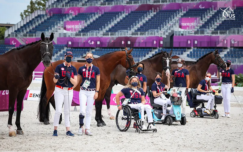
All of Team USA’s horses were accepted during Wednesday’s jog-up, the official start of the Paralympic dressage competition. Photos Courtesy Of USEF
There are USA's horse riding Paralympic teams and these are the people who have the disability and they could manage to be the champions and be the role models for every people.
one of the most famous UK Paralympic horse riding champions is Sohie Christensen.
Sophie Christiansen CBE is a British dressage rider who has completed in four successive Paralympic games and is currently an eight-time Paralympic champion, she has won multiple world and European titles. Following her success at the Rio Paralympics she was placed fifth in the BBC's Sports Personality of the Year and the highest-placed female and para-athlete.
Sophie was born prematurely by two months with Cerebral palsy and suffered many health problems which included:- Jaundice, blood poisoning, heart attack, and collapsed lung, Apart from her riding she also competed in half-marathons and won the Windsor half-marathon on in a self-propelled wheelchair race in 2002. The in 2008 she was awarded the Vivien Batchelor Trophy for the most outstanding under-25 rider by the British Equestrian Writer Association.
She was inspired when she went with her school to her local RDA centre:- RDA means Riding for the Disabled Association Sophie started Riding at the age of six as part of her physiotheraphy. After 10 years she had her first major international competition, she won this in 2004 at the Athens paralympic games, where she won a bronze medal and in the same year was voted BBC London Disabled Athlete of the Year.
2.Plan for your photography what do you want to take pictures of? what do you want to show? where do you want to go and take pictures? who is the model and main aim of your photography?
I will take pictures of the horses fully made up in Christmas attire and the riders who will also be in fantastic Christmas costumes, i want to show how the event will take place in a arena where the riders and their horses will put on a magnificent show to all that is attending.I will go to my horse riding center which is called Peniwells in Elstree.my main is is to capture the event in all types of photography including high shot and medium. The model will be someone at my horse riding.
The above pictures is how i would like to plan my event.
25/09/2023 Photographer Research
- Imogen Cunningham: Imogen Cunningham is an American photographer and was born on 12 of April 1883 and she died on 23rd of June 1976. She was born in portland. She was specialsist in nude, Botanical photography, and Industrial Landscape. She was a member of a California-based group known as Dedication to Sharp focuses on rendition of simple subjects. She was the 10th child of her family. Both of her parents originally came from Virginia. Her art wasn't included in the traditional school curriculum. She used to take art lessons during weekends and during her vacations.
In this picture there is a different kind of pattren and used of shape,it looks like she has drawn fingers within the picture, and the black and white makes it look very catching.The pattern looks like coral that you find in the sea, and a shape of a flower.The texture is hard so you can see all the different shapes and patterns, the lines used are wavey and curly.
- Cindy Sherman: Cindy Sherman was born 19, January 1954, her full name is Cynthia Morris Sherman and she is an American photographer also she grew up on Long Island, New York where she studied at the universiy and majored in painting, but later she major to photography. She is also a film director. Her work is mainly, primarily of photographic self protraits, drawing herself in many different ways and various imagined characters.
In this picture her portrait looks like jigsaw puzzles and she looks like a man but dressed like a woman's clothes with make-up and Jewellery, the texture is hard so you can see all the different shapes of the puzzle. The line are wavely and curly. The pattern looks like a huge Jigsaw puzzle, she has choosen big, bold, and brigh tand natural colours.
- Eliot Poter: Eliot Furness Porter was an american photographer best know of his life colour photograph of his natural. He was born on 6th December 1901 and he died on November 1990. From a young age he used to take many photographs of real estate that his family owned in Great Spruce Head Island.He studied medicine and chemical enginering and worked as a biological researcher at Harvard Universcity, but he really enjoyed doing photography, his break through came when he was introduced to 2 artist who wanted to show his work in a New York gallery in 1938, this was a huge success, making poter leave his work and make photography his full-time work.
In this picture I can see the waterfull falling in the sea and making patterns of little fountains going into the sea. The shape of the waterfall looks like clouds that are falling in the sea. The texture is nature as in the picture he is enriching the flowing of waterfall into the sea and the green of the trees. The lines are also flowing in many different ways the line from the waterfall are curvey and fall at the angle and fine lines on the rocks.
You can see a sans serif typeface on the left and a serif typeface on the right hand of the picture. The serifs are the little lines that are extended from the letters in the picture above. serifs make the typefaces more classical and the sans serif typefaces are more modern.
- Serif -Is it a modern or hairline serif?
A serif is a small line or stroke regularly attached to the end of a large stroke or symbol, for example, in this picture we can see a modern serif typeface because of the thin serifs of the letters.
A slab serif is a design with simple heavy strokes or bark that stands out and has thick lines and very unique and different.
script face is cursive handwriting, for the picture chosen is personalized and handcrafted for this brand.
This kind of writing is used for weddings, anniversaries, birthdays, and other occasions the font would not be romantic like in the picture above. This type is also personalized.
This is a style of joined-up writing with all the letters connected together making writing faster, this type of writing is done by hand using a pen, pencil, or digital stylus.
25/09/2023 New sketches of my final poster design draft.
27/09/2023
two social media
before and after
I made this poster in Adobe Illustrator. I added my photo and made it stand out. I also added the title of the event and I chose the right style of writing that suit my poster. I chose bright colour to make my poster stand out and readable. I chose different colors and fonts for the writing on the poster. If I had more time to do my poster I would make a different background or different outline.
I think i done really well but I need more time to finish the photographic poster and add more detail and to it more attractive.
Legibility and colour systems 28/09/2023
Legibility is the text of writing which can be read easily because the letters are clear. This is also in the design of the typeface and shape of the symbol, as well as how the font is arranged, or typesetter. Both font and typeset are important when setting text or any similar type sizes.
A Colour system is a set of colors which that represent a specific visual Spectrum there are four distinct color systems which are CMYK, Pantone, RGB and RAI all of them have their own unique usage CMYK is used for print, RGB is for on-screen example (web) Pantone for accuracy, RAL - for powder coating and plastics. The understanding of all of the above helps with the product design from printed materials, digital experiences, and even production.
29/09/2023
production planning
o
but i need to had more referencing
this is the Google form survey that I am going to ask my family friends or classmates
and I also got a responses from my parents and my friends
I presented my initial idea in front of the whole class. I had feedback from my class peers.
02/102023 Fashion Photography
definitions Examples of editorials, advertising, Beauty photography, and fashion photography
Editorial Photography is a type of photography that aims to tell the viewer this portray and concept. Editorial photography can be found in magazines. the purpose of editorial photography is not to sell but to express and engage the viewer with what this item is by taking creative photos from diffrent angles.
This editorial photo is a set dressed beautifully to tell a story.
This editorial Photography is to determine to tell the story that you want to tell and editorial photography is always composed of a series of photos that tell a story.
Advertising photography is the art of using photography to create images with a focus on selling or promoting a service, product, or band. also sometimes you may have ad campaigns that aren't necessarily there to sell but to raise awareness for example, governments might commission ad campaigns to get certain information out to the public which might be beneficial to them. These can be featured in newspapers, magazines,s and billboards.
This advertising photo shows that it had advertised different logos
This adverting the Coca-Cola photo
Beauty photography involves shooting close-up images of subjects, identifying their attractive features for commercial or personal purposes, this kind of photography can bring emotion to the viewer for example showing happiness or innocence depending on the type of the shoot.
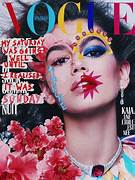
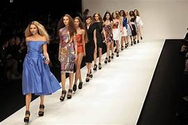
fashion photography can be images that highlight clothes, accessories, and fashion, items in the best way possible this includes poses, models, lighting, and backgrounds. Fashion photography is a combination of product, portrait, and fine art photography. This is common on advertising boards and in Fashion magazines. Fashion photography became popular in the mid-1930s to the present day, fashion is in many magazines such as Vogue, Elle, and Vanity Fair.
Lighting creates a visual mood in a photograph, there are two types of lighting:- Hard light and soft light. Hard light is more focused often bright and has a harsh shadow which draws attention to a specific part of the picture, it is also very defined. when you take a picture the subject is bathed in hard light, and the background will cast a hard shadow. Hard light is useful when creating dark, dangerous dramatic or mysterious mood in photogragh or film.
HARD LIGHT
Soft light is diffuesd light, so there are no harsh shadows like Hard light on the subject. Soft light comes from a large light source, this makes the picture have a soft- edge with gradual shadows without much definition. An example of this would be when the sun is shinging this is hard light source but on a cloudy day one can get brillant soft light from it.The clouds are spreadout making all the light coming from a single point,this comes from the entre sky.
Describe the the properites of hard light and soft light Hard light vs Soft light is a choice that many photograpers don't know they are doing this. The term quality is refered to both hard and soft light, but this does not mean that one is better then the other.
It all depends on the the mood you are creating and the impact the light will have. So let's have a look at the difference between hard and soft light, it all their shadows and contrast. Hard light, come from direct or distant source which produces a sharper picture, also defined shadows and high contrast intensifying the textures and details. Soft light transform from light to shadow. So the picture the edges of the shadows will be gentle and the light will seen to " wrap" around the subject that you are taking a picture of. The easiest way to recognize hard light vs soft light is to look at the changeover between light and shadow in your scene.
Explain how to set up studio for fashion photographic
Definition of photographic studio is a dedicated space for taking, developing,editing, printing photographs. Setting up a studio Photography is a huge industry, no matter what your taking photos of for example:- big coporate shoots or taking headshots of actors, having a studio photograph is really beneifical for everyone's career.
First of all you to have a good location where all kinds of transport is accesible, for example near a train station or near the motorway somewhere it is easier for the client to get to. You also have to consider space, whether you have need lots of spaces or less, taking this in to you plan when setting up, as this will help you in looking either out of town or near your home. once you have decieded on a budget that you want to spend you need to buy the equipment needed for your studio, also condisdering what type of Photography you are going to be doing.
The following is the eqiupment that you will need,these are some of the basic equipment so here goes:
1. lighting:- you will need one light, and a reflector this is more than enough, but a speedlight, a strobe or a large flash gun that is attached to your camera paired with a reflector which looks like an umbrella also works.
2. Flash trigger:- You will also need a Flash trigger this is a off-camera flash that will give you a better image than using the built-in flash on your camera.
3: Light stand:- this holds your lights and other equipment in your studio. They are adjustable and a huge part for getting the best lighting for your shoot.
4: Backdrop:- these are again a necessity for filling the backdrop for your photos.For a basic studio you will need:- a paper,textile or any simple backdrop that is not expensive.
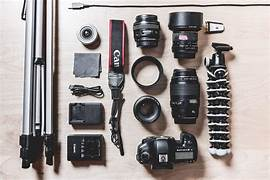
5: Camera:- this is the most important equipment for your studio, a good camera is useless without a great lens, so you must consider this when buying a camera.
6. A computer:- This can be handy but it is not essential, a computer will allow you to see the image and you can edit instantly if need be.
7. Storage:- make sure you have plenty of storage for all your equipment, a studio should be neat and organised.
8.Props:- these are a must for your studio, you can pick up cheap props in many places like charity shops and car boot sales.
9.Power Extensions:- you will need lots of sockets and a good supply of electricity. Bulit-in sockets are good as this will look neat and your clients will not be tripping over the wires.
10. Furniture:- this is a must to have to make your clients and visitors feel relaxed and welcome it also shows that you are professional, make sure the furniture is morden and nice.
11. Interior Design:- this helps when you are choosing colour and texture for your studio. The design of the floor,walls and ceiling all need to be taken into account when you set up your studio.
All the above is how to set up a studio for fashion photography.
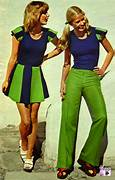
How fashion has changed Fashion is always recycled in the fashion world. Over the years fashion changed drastically but has kept the trends from the past. In the 1950s it was old-school trends and later a more modern style in the late 2000s fashion is on a never-ending wave of change. The 1950s was a fashion for both men and women, the popular clothes for women were fitted blouses, shoulder pads, round collars for women and high-waisted pants and ties for men. Many printed patterns were hand-decorated with paint and beads, this made them unique. Hats were the biggest trends in the 1950s for both men and women, women took after Audrey Hepburn, as she used to hide her short hair. Men wore felt hats every day. Cigarette case were also an accessorie. The 1960s were the happie movement, tye-dye was very popular, everything from headbands to shoes. Turtle necks were in for men and women.1970's were bell bottom and checkered and floral print - from pants and mini skirts. When the weather was cold then fur coats were worn. By the end of the late 70's heavy metal fashion was in and some of the trend from the years before come into the 80's like shoulder pads, Jean Jackets, and leather pants. From the 2000's we saw tracksuits from the 80's and skinny Jean along with hip-hop clothing and branded tee-shirts. 2010 fashion has included everyone, from popular trends like boho, Asymmetrical tops and skirts and maxi skirts. Jeggings and legging were popular. The trends were in many shops like Zara and H&M. The presnt day has seen the fashion trend from the 2010's and still is very much in trend.
1950
02/10/2023
This is the final drawing graph poster of my final event idea for my assignment. I will improve on my poster by adding more colors to my poster.
04/10/2023 Final graph poster
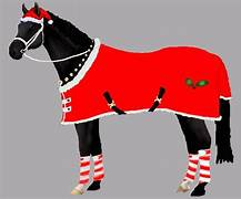
This is my final design graph poster that I have improved working on it. I used Adobe Illustrator program and I used it to draw the horse and the holly design on the horse then I used the paint tool to paint over the horse to make it colourful. The theme is Christmas so I used Christmas colours and drew a holly on the horse. Also, I have added the detail around the graph poster. I have added the text box to write a title then changed the colour to red and green and also just green for the top title. I then added the background to look good and match the horse.
I think I did really well and I like the colours and detail of the graph poster also I need more time to add more details and more colours to this poster to make it more attractive.
This poster of the title is without the stroke so it can see the writing properly
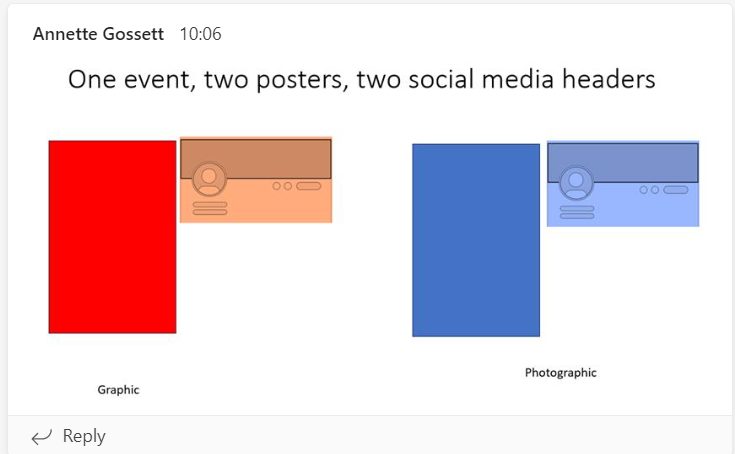
04/10/2023 Plan and sketch for one event, and two social media headers .
Social media headers should relate to the actual poster that I created.
This is social media graphic Facebook poster also I have added the background, snowflakes the horse and the text title on Adobe Photoshop.
and for social media graphic Instagram poster also I have a background with ,snowflakes the horse and the text title on Adobe Photoshop and also copied from Facebook poster from above .
This is a social media photographic Instagram story also I have added the images of my horse and Christmas tree I haven't taken for myself
This is a social media graphic Facebook poster also I have added the images of my horse's Christmas tree and the text title on Adobe photoshop also copied from Instragram story from above.
09/10/2023
Survey result
This is the feedback result for my survey
For the first question I asked when is the best date for the event and people prefer christmas holidays time for this event.
For the next question, I ask when is it for the event and people prefer the afternoon and the middle of the day.
For this question I ask what is their favourite tagline in this event and people perfer It's time to ride in a "one-horse sleigh" .
For the last question, I asked what kind of participate ticket you would like for this event and people showed that they would be happy to buy the tickets for his event.
09/10/2023
I should change the time and date of the poster
Final project
To get a real feeling of the products I put them in the real area picture.
11/10/2023
Evaluating/reviewing final productThis is my project on Horse riding for the disabled and wanted to target young and old who would like to have an interest in this and see what it is all about.I chose this event as I myself go horse riding and it has helped me and so wanted to show everyone else what they can do.
I am advertising for young people and adults with disabilities, who enjoy disability horse riding to help them with their core and physical movement,the young people from the ages of 7-15 and the adults age from 16 -onwards.
The aim is to advertise the event of the Christmas Dressage charity, using social media which was Facebook and Istagram, I also advertised on the bus stand so it is visual to all and people can see, this way many people would be able to let their friends and family know about the event.
- Describe your final items. What influenced you to do this as your final
product? (Mention some research/skills/strengths, including the use of primary
research)
I have researched different events for horse riding for disability where I go horse riding as they have many events for funding raising, this influenced me in doing my own event and to see how well I could make it happen. My primary research is that I used a survey and interviewed people. I did this to get an idea as to how many people would be interested for my event. The skills that I used were drawing a mind map of the events that I wanted to do, but then eventually went for horse riding and started to plan my event, from the cost of the event to the adverstising of my event.As christmas is around the corner , I thought it would be nice to have a horse riding dressage for the disabled.My strengths in planing this event were the physical ,as I took many pictures of me and my horse when i went horse riding, and also doing a mood board which helped me a lot for oranizing this event.
- Did you make a plan and follow it? If you deviated from your plan, explain
why and how.
Yes, I made a plan for my events which I followed through, I finished all my work on time. I couldn't take pictures myself because I could not handle and grip of the camera but I art-directed the pictures and told the photographer how I wanted the pictures to be taken, My plans were a brainstorming mind map, moodboard and made a sketch of my poster,also in my plan I inclueded survey and interviews.

- How did you create your products? Tools/techniques/programs you used.
I have used software programs which were the following: Adobe Photoshop and Adobe Illustrator, I also used a pen tablet to create a graphic poster and this helped me draw the horse ,I used a Camera to create a photographic poster for myself .I used different tools for both posters which are Photographic and graphic poster to create my poster and also canvas.
- What form was your research, both primary and secondary? How did it
influence your final products and why?
The form for my research was both primary and secondary. For the primary, I found out the best date, best time, and best tagline by doing survey and interviews from as many people as I could. The secondary research, I found out pictures on google and who the competitors were that I need to stand out and make an inpression, I also found information about horse riding and famous disability people.The survey and interviews influenced my final product as these helped me gather all the answers that everyone gave me to carry on with my final product in creating a magnificent event in horse riding.
- Were there any problems? What did you do to overcome them?
The problem was the camera setting and directing my own pictures. I directed the photographer to
take a better picture. Also the background i had to change to a christmas one as the other one was ordinary.The original poster that i made had too much information on it and it looked busy so i changed it and took out a lot of information and made it simple.
- What went well with the products? How well did you complete the
products? What standard is it? Does it communicate your ideas well?
How/why?
I feel that my product is well designed and they can communicate to the audience of the event. By using the picture of the horse and putting the elements of Christmas the audience can have this idea of what this event is about and the poster can tell others about Christmas Dressage charity.
- What went less well? Is it messy? Not what you wanted? Not finished?
Why do you think this happened?
I think if I could take a picture in another pose maybe a horse in motion or another pose for myself would be better. And also I could have some decorations for taking the picture and have a different background for my horse.
- If you were to repeat the process again, what would you do differently and
why?
I need the camera setting changed and also I think would be better to take pictures in the Morning or Afternoon because the light would be better and less shadows.
12/10/2023
Exposition
16/10/2023
Timemanger
This is the the time mangement work that I did in class and to see what i do in everyday life.
20/10/2023
This is the team work that we did as a group and we made a 3D animal which is a cat


.jpg)
.jpg)


.jpg)


.jpg)
.jpg)
.jpg)
.jpg)


.jpg)


.png)
.png)
.png)
.png)
.png)


.png)

.png)


.jpg)
.jpg)


.jpg)
.jpg)
.jpg)
.jpg)


.jpg)
.jpg)
.jpg)


.png)


.png)


No comments:
Post a Comment