This shot uses low-key lighting: it had too much shadow. The only light is the table lamp.
The back lighting is coming from the back window, The filler light is coming from the candles and the light lamp, also key light is coming from the vase of flower.
This shot uses low-key lighting: it had too much shadow. The only light is the table lamp
The filler lighting is coming from the light lamp. There is no back lighting in this picture.
This shot uses low-key lighting: it has a backlight and fills light. The lighting creates sad emotions. The filler lighting is coming from
This shot uses high-key lighting: it has a fill light (ceiling) and background lighting. it had a key light on the front of the room which reflects their faces.
This shot uses low-key lighting: it had a shadow on the wall. There is artificial lighting coming from the door. The lighting tells us that the characters are feeling sad.
Analsing this this picture 16/10/2023
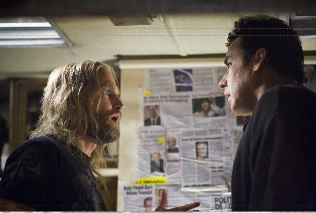
In this picture There is a man who is carrying a child on his back. The facial Expression & body language that they are feeling scared and shocked. The costume, hair & make up I can see that his clothes are dirty from smoke of a fire and they are trying to run away from something.
I can also see behind them some ashes and some smoke and fire on. Also I can see that it was snowing and also it was dark.
In this picture That the facial expression and body language that are looking confued and worried that he was looking in the sky if there something going on. I can see he is sitting on a chair with his laptop in the forest or garden, also I can see that he is doing something on the laptop. The main colour is pale green that shows the forest in the backgroung but the yellow colour of the chair shows us the man is enjoying his time in the forest. The position of the camera is behind of the man to show the audience the screen of the laptop and tell us that he is working or watching something important.
In this picture This photo film from the ffilm Tatamric they are looking at each other try to neat up as they in water frozen. They look sad and don't have hope to live. The main colour in this scene is blue and the colour in this of their skin is pale which shows us the freezing weather. The facial expression & body language that are so sad, disappointed and they are hopeless. The setting of the scene like the ice in the sea and the snow on the hair shows us coldness of the water. The position of the camera is very near to the actorsto get close-up shot focus on their facial expressions and feelings so that the audience can empathise better with this romantic scene.
In this picture the photo is from the film Titanic it shows that there are very happy, excited and also so close to each other. The colours shows the warmness and love between them. Also the posture of them shows their the freedom and feeling free in their lives. you can see the wind moving and swaying the lady's scarf and both their hair.In the background it looks like a sunset, this makes the picture very romantic. The setting of scene in a beautiful background that looks like a sunset, in the cloud, and they are flying in the air together there is also some light, so you can see the smiling faces. I can see that they both wearing black and white clothing, the lady is wearing a skirt with a band across her wrist and a beautiful shawl around her back, the colour is yellow and brown with some. Her hair is tied back an a ponytal and his is short with the wind blowing the top and a bit flying away. The facial expression on both are very happy,excited and very romantic.The body language the man is holding the lady at the waist so she can have her arms out like they are flying. The position of the camera is in front facing so you can capture everything from the sky to the people.
In this picture I can see that they living in the house and they are having a evening meal as a family, the dad and daughter are looking at their meal, but the mum is looking at the daughter maybe chatting to her. The setting of the scene is that they are sitting in the dining room having a meal. The props there are many, from lamp shades to wall lights. Also you have candles and flowers on the table and a picture frame on the wall. The colour is showing browns and yellow and some dark areas.The father and daughter are looking at the food but the mother is looking up and they are looking sad and engrossed in their meal. Body language shows that they are eating their meal with their knifes and fork. The poition of the camera is front facing to capturing the mood of the people with the light coming from outside as well as the wall light.
20/10/2023
Auteur theory
Auteur theory is filmmaking in which the director is viewed as the major creative force in a film or a motion picture.
for example:
Tim Burton is one of the most iconic directors which has his own type of direction. He has his own type of Mise-en-scene, dark and grey colours, and some old Gothic clothing. In Edward Scissorhands, Tim Burton has his own ideas and direction throughout the movie like the dark colours and low-key lighting, the outfits, and the main topic which is the contrast between the darkness and love that he uses in most of his works.He is known for his goth culture in the American film industry, he has wirtten,directed and produced many films many of which been box office smashes.Apart from films Tim Buton has also done some music,videos,televisionseries and advertisments.
Christopher Nolan CBE is a british and American filmmaker and writer. From low budget independent film to some of the biggest blockbusters ever made. In the Dark knight Nolan used Mise en scene appropriately as it has helped the Joker become an ice and one of greatest villians,this helped the film turn into a success.As you can see in the picture the jokers face is plastered with white and red make up with black eyes,all this highlights his dark and twisted personality.Nolan has created a film where it makes the audience think that Gotham City really exsits and that the joker might be real.The film is a modern classic.
Steven Spielberg is one of the best known director and the wealthist film maker in the world. He has a number of credit to his name, either as a director, producer or writer. He was born in Cincinnati,ohio,USA.In the film BFG(The Big Friendly Giant) the mise en scene is that the Giant rescuse a young girl from her orphange in the middle of the nightand hides her from the other giants as they want to eat her.Spielberg has created a visually stunning film,the effects on the giants and rural landscapes of the country share the magical fancy of the film. The film brings fantastical and is a heartwarming film that is hard to find in children's movies these days.
16/10/2023
Typography Rules & Magazine Design tips
Now watch this video and make notes on Typographic rules for magazine design:
There are 7 types of rules for magazine design Entry points are needed on your speed they will help the reader to read the text:- These can be the following:- drops caps to headings to titles to pool codes, having these additional details helps to capture and drew you into reading the article. This is everywhere we look from the books we read to websites we visit, and in everyday life when we are out and about e.g street signs to product an shops. typograpic is a simple style of appearance or text.
Fonts are the main type for this: Main body text and Text is for web, the main body text is between 10 to 12 points in size and for the web it is around 15 to 25.
There are indents in all paragrahps,but do not need these and you can use the dropcaps to create your paragraphs.Line length or measure as it can be known is very crucial and important as this means that each of your lines sholud be between 45 to 90 characters,this should inclued spaces as well.To check this you should triple click on the text and go into the menu for information panel.Make sure you widen the columns or text frames.The importance of measure is to improve the readability of your text,this means the convenience of reading for the reader.
so if the text made wider then measure is over then it will be too long and not very nice to read as you have to keep on jumping from zone end to the other (so example from the end to the begining) and if it is narrow then the text will be gumping back and forth between the two sides while you are reading.
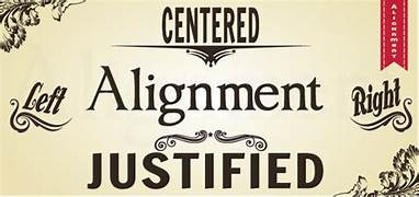
You can be creative with alignment but remeber there is a couple of things you need to know and they are:- First of all Align left or flush left is the most common way of setting type and also justification is commonly used as well The difference between them is that with justification you get straight edges on both sides, you need to be very careful as you can end up creating rivers in your text. This means that when have a narrow text frame you need to press command or control shift J, then you will see some big gaps appearing. If you make it smaller text then you will see more bigger gaps within the text, you may not notice this so when you are checking your text make sure you turn it upside down so it will be easier to find them. To aviod rivers from appearing in your text to use justification on line lenghts higher then 60 characters and make sure that you allow hyphenation. There is also a flush write or align right option but this is only used when there is a reason for it.
When using flush right or align right you can use the pool code to the left and create a visual negative space in order to align the text on the left, so this text is flush right or align right, this means that you will have a straight edge, but as you will have a ragged edge on the left makes it difficult to jump and back and start reading the lines, this is why flush left or aligned left is used more as it is readable for your reader, and a last piece of imformation when using flush right or left aligned you can use the balance ragged line option, this can be saved as a paragraph style feature, this can be found as a additional option. You can use type pool to give you balanced ragged lines,having raged lines is more organized and when you have this feature.
The break up of block texts this is whrn first lining should not be used on the first paragraph, but it is important to break up these block to make it easy to ready,as people need to know the begining and end of the paragraphs without any hidden characters, as a designer you should make this visual to the reader.There are two simple ways to do this: one is to make a indent and the other is to increase by 7mm as this will look much better.To select all the paragraphs and use all the space between paragragphs feature is to use 4mm this will crreate a more better read for the reader.It is wise to use only one or the other and not both.
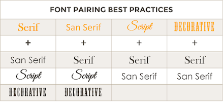
You can use two types of text fonts as this can be useful to separte the text and create a visual diffrence btween them.The frist type is the x-height: This you should keep the same as it is good to have a visual contract between the two fonts so the reader can see the difference. The other type is AZ-Serif font andsan serif these can be a problem if the x-height is not the same , this is when the height of lowercase letters in a typeface are closer and you can match this with the two fonts. Hyphens are important and as you need to apply optical margin alignment or roman hanging punctuation this will keep the hypens outside the text.
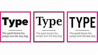
Last is All caps or captial letters, this is a great way to used on the titles&headings but not to use it on longer block of text as this will make reading not great and it feels like someone is shouting.
Tate Morden art gallery
The Palm by Yto Barrada who is a Morrocan artist. He used colourful lights and the Palm as a modern city sign.
The hanging textile which was presented as Hyundai Commission 2023, is named Behind the Red Moon. In ground floor of Tate Modern.
Reflections on Girl is a painting by the American artist Roy Lichtenstein. this painting is a combination of dots and lines.
An installation by Jannis Kounellis made of coal rocks and colourful glasses.
This is a view of London on the top floor of Tate Modern. It was a cloudy day and we can see the active city in this picture.
This is the Flag grid by Fred Wilson, a combination of black and white flags.
Govent gardens
The graphic painting on the wall at London graphic centre.
The decorations of the ice cream shop
This is the Covent Garden hallway
This is the decoration of the perfume shop in the market.
This is the decoration of the glasses shop.
I really enjoyed going to the trip on wednesday 18th october to tate mordern art gallery and Governt garden with my class and took the picture that I like.
30/10/2023
mind map of plannng for my magazine website and opening scene
This is a mind map of the topic that I want to make my project about.
My project, about the community of disabled people, is about the traveling of disabled people, what technologies they use to help them, and what problems they have during their travels.
mood board
30/10/2023 Magazine Analyse
This is the cover of the magazine. What stands out from this cover is the main picture the main heading and the colour of it.
The images including sub-images that are going out of their frames the colour of the texts, and also the fonts used, make this cover appealing.
The images stand out the heading is the colour of the Pull quotes and the Large initial caps on yellow in contrast to the colour of the text.
The magazine looks beautiful because of the images which are used and the contrast between the colours of the texts.
01/11/2023
Practice magazine layout InDesign
I have followed the instructions on the Demo Video that my teacher has created for us. I used InDesign to create a magazine layout.
I have made a progress on doing the Indesign practice using demo video which my teacher has created and almost finish doing it. I have created six text boxses and character styles and paragraph styles. I also added headline and introductio paragraph. I also connected text boses to each other.
03/11/2023 Website Analysis
3 bad magazine
The colors make it difficult to read, and the lines and the shapes make the background cover crowded, the subheading is small and it is hard to read the tagline is so big the heading is not big enough to get attention at first glance. The colour of the face makes me feel disgusting and not natural.
This is the previous magazine style any headings, subheadings, or subimages. The main colour is orange which is the colour of the paper used for the cover and the printing colours are just black and white. we don't have any idea of the issue number.
This magazine cover is not very good cover as there is writing all over the lady's face and the heading is not central so the reader will not know what kind of magazine it is. The colour of the face makes me feel that it has too much writing and is not natural and is just too much colour on the face of the magazine which you can't see properly, also you can see a crack on the lady's face meaning that there is a fault in the design of the cover. There is also no issue number or what month it is.
and good magazine
This Magazine cover is very good as it is very eye catching, the colour blue is very virbrant and has all the information about what the reader would like to read.The heading is central and has an issue number and the month.The model on the cover is showing the fashion side of the cover.
This magazine cover is very good as it is very different design as the heading is inbetween the model and the decor making it unsual, also the colours choosen by Elle are natural and looks sharp. The sub heading is very clear so the reader can see what they like to read.Also there is a website on the side of vthe Magazine which is a brillant idea.
This magazine is showing that it is about everything the reader needs to know about weddings.It is beautiful desing very simple and effective with a pale pink backgroung and also the bride on the front of the cover does look amazing.
6/11/2023. Information literacy
I worked in paired with Anna
08/11/2023
planning magazine cover
I have put my project, about the community of disabled people, about the traveling of disabled people, what technologies they use to help them, and what problems they have during their travels.
living with disability
Getting around
Be able to travel on your own
To be able to cope by yourself
for my magazine cover, I would choose to do whatis getting around.
this is my magazine about experiencing Europe with disability
this is the magazine about getting around but living with disability
this is my magazine about working with disability
I will make my improvements if I have time to fix them after I finish my magazine spread.
13/11/2023
Survey primary research
resault
4/12/2023
For primaary research I understood that most people want to recieve the magazine monthly. The magazine covers should be available in NHS and community centres. for adevertisement of my mazagine is newspapersand TV. For topic of my magazine the poeple's experience.
For logo that prefer the third opitons and also for my magazine covers which is options 2 is better.
Secondary research
similar magazines
Able Magazine
Possibility Magazine
Handicap Magazine
DRM magazine
18/12/2023
Final magazine cover
I have change the logo,and sub-images because of my research results showed me that most of the people liked this logo and they prefer to see the life experiences in this magazine. Also because the survey showed me that people want to have the magazine once a month I changed the date on the magazine.
13/11/2023
Binary opposites
s
15/11/2023
Magazine research
I have chosen Irma Boom, Irma boom was born in Lochem on 15 December
1960 and is a graphic designer who specializes in bookmaking, she was the youngest
child of nine in her family. She was best known for creating 300 books and is
well-reputed for her artistic work within her field. Iram Boom has spent her career questioning the design book as we know constantly challenged with her unique architectural approach. She went into designing books by accident while studying painting at the AKI Academy of Art & Design, while attending a lecture on book design and this inspired her to stop painting and join the graphic design department.
A different picture of her work which I have found on Pinterest is - Iram Boom's work which was created in 1960. In this work, Irna Boon used the pages and the elements on the pages as architectural tools to create the autumn feeling. Each page completes the others as they are flipped on each other.
I think this picture had the color and the pattern of the tree and the other side of the grass also
it is about nature and I like nature pictures that have a circle on both sides with different colors
It is an example of her work - Irma
Boom Vitra's work Spirit Book 1998. It was created with the
chair upside down and also the holes that show previous pages' images through them and complete the design of this page.
I think this picture has the images of two chairs and is shown in two different directions one which is up and the other one is down, also it has a different color background and two different 3D solid balls and on the other side has five different color little circles. I like the picture because of what I mentioned above.
Iram's book design for Chanel brand which Boom designed beautifully with a brave piece and the book was completely without any ink, with Boom opting for embossing every single image.
In the book KnollTextiles, she was invited to design her own textiles, she created strips to show the colours and printed them on textiles and fabrics instead of paper.
This story follows Harry's second year at Hogwarts School of Witchcraft and Wizardry. The heir of Salazar Slyterin opens the chambers of secrets unleashing a monster that scares all of the students.
POINT: In the opening scene in Harry Potter and the chambers of Secrets Harry spends the summer with the dursleys. The location is set where there are lots of houses and street lights. The evening is dark with only the street lights showing Harry in his bedroom looking at photographs of his family and friends.You can see Harry talking to his owl pet called Tedwick which was quite unusual. He comes down and has a chat with his family if he can let his pet owl out for a little while but the answer is no.
EVIDENCE: The characers in the film Harry (PROTAGONIST)who is a very nice person and makes friends very easily,but he is not happy where he is living for the summer holidays. Then we have the Dursleys : Aunt and Uncle and Dudley the cousin(ANTAGONISTS).The Aunt and Uncle are horrible to Harry always angry and their faces are frowing and look very grumpy.Dudley is very rude and aggressive to Harry and not a nice person.Harry looks at photograhphs of his family and friends and how much he miss them all, this is what we learn about the film, also that they have guests for dinner and Harry is locked in his room until they have gone.
EXPLANATION: The scene reveals how Harry is keen to get away from his Antagonists and go back to school where he can be with his friends and away from his Aunt and Uncle,it makes me feel sad about the way Harry is been treated.The costume that Harry is wearing are normal clothes eg: sweatshirt,trousers which are comfortable and plain,yet the dursleys are all wearing smart clothes, the Uncle wearing a suit as well as the cousin and theAunt wearing a beautiful dress.
Exposition:
Harry staying with his family the Dursleys
Looking angry face's from the cousin Dudley.
Harry going to see his family for the summer holidays.
The movie Has great action to beautiful scenery shots. A huge blockbuster film with a paleontologists and a mathemation who find them selves in a theme park populated by dinosaurs who are created from pfrehistoroc DNA.They think they are safe but the dinosaurs break free and go on a hunt.
POINT: In the opening scene in jurassic park open in the jungle at night time, making it look very creepy there are lots of trees, leaves and branches making a rustling sound like there is something behind them. The location in Isla Nublar 120 miles from west of Costa Rica. There are many workmen/women carring guns when a large cage is being transferred by lots of builders, it being lifted by a tractor, and leaving everyone in suspence as you hear a screaming nosie coming from the cage. The noise sounds like there is a dinosaur in the cage.
EVIDECNE: The charcaters in the film are builders workmen/women all wearing hard hats, the opening scene doesn't have any main protagonists, but that the park is a bad idea with a dinosaur-theme even though it sounds like a cool idea. This is made clear in the opening scene as a dinosaur handler is killed by the velociraptor.There is a lots of shouting going on to shoot the dinosaur. Anything that you can't see is always scary- '' the scene made me feel scared because I didn't know what it was''.
EXPLAINATION: The scene relveals that the park was bad idea and that it introduces the danger posedby the dinosaur. This is where the worker shout '' shoot her '' and the tragdey happens as one of the main characters a gatekeeper dies as a results of the dinosaurs pushing the cage away from him. Any unseen monsters are going to get the audience to see the whole film while the imagination will be doing allsorts. The costumes the workmen/women are wearing hards hats, a uniform and carrying guns.
Peter pan is a fantasy adventure film, about Neverland a magical place, and the story of peter pan. He is know as the boy who never grows up as he is a fairy. A truly lovey film for the old and young.
Point: In the opening scene The words '' All children grow up, expect one > peterpan, this sets the scene for the film to be intriguing. It is set in London, you can see the tops of all the houses in the street where the Darling family live, you can see into the window with all three children are in their bedroom, Wendy is telling stories to her two brothers John and Michael, when Peter Pan is hidding outside of the window and the children never get the chance to not grow up as they join peter pan and fly off to neverland.
Evidence: The characters in the film are:- peterpan,the protagonist, who is a magical boy who had never grown up and he lives in Neverland with other boys that are called lost boys. Wendy is who Peter takes her to Neverland to see his mother and then you have Wendy's two brothers:- John and Micheal who also join in the journey, the children are Anagnoists in the film. You also have their parents Mr and Mrs Darling,the nanny who is a dog and the Aunt who came for a visit. There is maybe some romance between Wendy and Peter pan so it would seem as she has a hidden chin which shows a kiss on the right corner of her mouth.. It is definitely a film that one should go and see what happens to Wendy and her brothers. Also for the children to see where Peter Pan lives. It tells me that Peter Pan doesn't grow up and he is a fairy. You can see that Peter is still very childlike.
Explanation: The Scene reveals that children are wonderful and fun but are also innocent and it is a must that they grow up. Peter is a childlike and innocent and his imagination goes for and beyond the value of growing up and experiencing the life outside of Neverland, and seeing the challeneges and pleasures of aduthood.The uniform they are wearing costumes from differents stories from disneys and unerneath they have the pyjamas on.Definetaly a fairy tale to be seen.
23/11/2023
Opening scene
Exposition
To show the power of disabled people and their abilities to be independent and experience life and travel as normal people. We want to show that inspite of some problems the people with disabilities encounter, they can experience and live their life as others and we shouldn't think they can't do something (like traveling) just because they have some disabilities.
Characters of the opening scene
1. Lillian - a young girl ( aged 18) who is in a wheelchair. She is enthusiastic, happy, chatty, and independent, she likes to play guitar.
2. Tanuja - Lillian's friend is also 18 and is sporty, lively, and bubbly, wearing a bright-colored tracksuit.
3. Kasia - another friend of Lillian (18) who is kind, friendly, and sensitive and likes acting and is also a musician. She wears glasses, jeans and a jumper.
other characters
4. Owen - helps Lilian to go in airplane and helps her with her suitcases- He is friendly, may have some tattoos on his arm.
5. Taxi Driver - helps Lailian from the airport to the hotel. - he is funny and tells her jokes in the taxi to the hotel
6. Neha - Reception at the hotel- she is very chatty, helpful
7. Dev - He is a customer in hotel cafe who sees Lilain and becomes her friend - he's shy, doesn't talk too much, fed-up with life, and thinks life is boring- after he becomes friends with Lilian he will be happy and more sociable
Setting
It's the end of the summer term. The three friends who have finished their art and design class are in the canteen at school, eating their lunch. They are discussing plans for a summer holiday together.
Script/ Narrative
Camera comes from outside the the canteen like somebody is looking at them and wants to hear their conversation. then it stops next to the table which the characters are sitting behind it. Then camera zooms on Kasia as she starts talking.
Kasia : I'm really looking forward to the summer holiday. Why don't we make plans to go on holiday together abroad?
(The camera pans to the other scene with a motion blur transition and the next character appears in the next scene.)
Tanuja : That would be a lovely plan. (She jumps up and down with excitement) Where shall we go? I'd like to go somewhere that is warm and sunny and to a hotel with a spa and swimming pool!
Tauja is dreaming about the trip and she imagination of hotel comes from her mind and we see the hotel and spa with the swimming pool. While we are in the canteen talking.
Lillian : It would be great to go on holiday but maybe to a cottage in England as it will be easier for me.
(The camera movement will be closer on Kasia face as her face experison changed).
Kasia : Maybe we should go without you Lillian as it will be too difficult to travel with you, as you are in a wheelchair. (with a serious voice)
(sad music plays in the background) shift transitions)
Tanuja : I agree Kasia. It's too hard to go with you and push your wheelchair Lillian - it will be too tiring for us.
(The camera movement will be on lillian and it will make lillian upset)
Lillian : (She looks upset and feels angry too) You are making me feel left out and isolated. Also, I feel like you are betraying me. That's not fair. I can travel on my own so why can't you travel with me?
(sad music plays in the background) I can show you how I can travel myself.
The next scene is lillian going to the plane by herself,and she was happy and cheerfully.
30/11/2023
Diegetic Sound for opening scene:
Sound of people chatting in the background, the clunking of cutlery, and music with someone listening to Spotify on their mobile.
Non-diegetic sound:
Music as the scene is ending. "Moonlight Sonata" by Ludwig van Beethoven.
20/11/2023
magazine spread
I created a magazine spread using A4 inDesign and added the text and the quote text but when I tired to the information about my Experiencing Europe with disability how it effect me, and my teacher say it too my text boxes so but it doesn't matter about it and I tired at least if i have to fixed it up in my own time also it too much text boxes on the right side so but it doesn't really matter if I have time to fix it.
22/11/2023
Content spread magazine
This is my plan for example article heading:
> Calling all aspiring disabled journalist
> Disability Expo 2023
> Fashion scholarship launched for disabled students
> wheelchair football league is almost here
> Fighting for our rights: The disability union
>Chair yoga for wheelchair Users
> Life in a wheelchair
> Hero Guide Dogs helping the blind
> UK-only new wheelchair-accessible car
This is the final content Page magazine spread I tried my best to figure out where my picture went and the content page to make it equal in size on indesign and when I first started doing this I didn't know where to start so then I know what to do next when my teacher or LSA explain to me how do to use content page magazine now so when I first started doing this it was messy so then I figure out how to put in the right place.
04/12/2023
explain how I did it
I have used indesign to create and change the magazine cover and content spread. For next time I should do something better which is to put travelling er
I have created dialogue recording on my favourite movie which is harry potter and the secret of chamber which was very interesting. The green boom mic recording there is no echo
and background noise so this makes it clear, on the blue camera recording its got a lots of echo background noise and doesn't sound very clear and not nice to listen. This is the difference between boom mic and camera audio. On the boom mic the echo goes away and so what ever you are saying is much clear. The camera recording had background nosises and this made it difficult and wasn't clear. I think that the boom mic audio is much clear than the camera audio. I used premiere pro which I have used in the past, this help me to edit the sound and recording of Harry Potter and everything was good so I uploaded it to youtube. I also had to edit the video recording and the sound to how I thought was a good sound.
This is the draft script video that I just did last week for my opening scene about disability
Script/ Narrative
Camera comes from outside the the canteen like somebody is looking at
them and wants to hear their conversation. then it stops next to the table
which the characters are sitting behind it. Then camera zooms on Kasia as she
starts talking.
Kasia: I'm really looking forward to
the summer holiday. Why don't we make plans to go on holiday together
abroad?
(The camera pans to the other scene with a motion blur transition and
the next character appears in the next scene.)
Tanuja: That would be a lovely plan. (She
jumps up and down with excitement) Where shall we go? I'd like to go
somewhere that is warm and sunny and to a hotel with a spa and swimming pool!
Tauja is dreaming about the trip and she imagination of hotel comes from
her mind and we see the hotel and spa with the swimming pool. While we are in
the canteen talking.
Lillian: It would be great to go on holiday but maybe
to a cottage in England as it will be easier for me.
(The camera movement will be closer on Kasia face as her facial expression
changed).
Kasia: Maybe we should go without you Lillian as it
will be too difficult to travel with you, as you are in a wheelchair. (with
a serious voice)
(sad music plays in the background) shift transitions)
Tanuja : I agree Kasia. It's too hard to
go with you and push your wheelchair Lillian - it will be too tiring for us.
(The camera movement will be on Lillian and it will make Lillian upset)
Lillian : (She looks upset and feels angry
too) You are making me feel left out and isolated. Also, I feel
like you are betraying me. That's not fair. I can travel on my own so why can't
you travel with me?
(sad music plays in the background) I can show you how I can travel
myself.
The next scene is Lillian going to the plane by herself, and she was
happy and cheerfull.
09/02024
opening scene Evaluation
I made the opening scene by using Adobe premiere Pro for editing ,I also used Adobe after effects to edit the background for me to appear in an aeroplane.I did my plan by using the script for the opening scene , i also made a draft video to show how everthing looks likes, i directed my characters which are Anna and Poppy , where to sit in postion as i am director of my opening scene , i enjoy doing editing and directing and also filming and talking to my classmate in my video.
I got help from others to help me edit some parts that I didn't understand. I also had trouble syncing the audio on the boom mic to fit the people speaking on the video but I am happy with how it went overall even if there were a few mistakes.
I choose sad music for my charaters because Anna and Poppy wanted to go on holiday by themselves without me,but I was very sad as they should have traveled with me and not by themselves ,I got the sad music from https://pixabay.com/sound-effects/ and happy music as well from the same link.
I was also trying to make facial expression of myself by having a angry face when i was trying to to communicate with my charaters but i just couldn't do an angry face to look at my charaters as I tired my best to have an angry face ,I was trying so hard to be angry that I forgot to edit my soundtrack that I got for my opening scene.
My opening scene is for people who can travel on their own with the wheelchair and how hard it is for them, but nothing can stop people from travelling who have any kind of disability, my opening scene will help them to find out how they can travel on their own with pride. If I have more time I would do a video again while I could do a short test of some footage and sound and check it is OK before doing the full filming.
I could found out from the technician why it did not the sound did not synchronise with the visuals in the footage. And I should look at the charaters when speaking and looking athe carmera.
This is my result that I asked 4 people to do my feedback, I got good message, nice green sceen usage also I should have put some soundtrack in the background and loved the green screen something different from the others, like my messages that I was putting out.
Diegetic sound is a sound that orginates from the world of film a simple way to think about diegetic sound is to think of that could make sound in the world of a film if the charaters can hear
Non- diegetic - is the sound that not recorded during the video recording. music, speical effect, transtions, non- diegetic is a sound that actors in a movie or film can't hear but the audience can hear.
Contrapuntal is when music is made by using lots of different meldody lines, which when played together have a harmonious sound.
ADR - stands for Automated dialogue replacement is a way to improve the sound quality of an actor's lines after filming has finished, this is done in a quiet area as you will then get the best quality sound.
Foley sound- are sound effects which are added to the film after the shooting has stopped,these include sounds such as footsteps,paper folding doors opening.glass breaking and many more.
Soundtrack- is a recorded sound of music which can be found in drama, book, video games and television programme.
soundscape - is a mixture of different sounds that are heard in different places,also a work of art or performance which performs souns and creates different effects


.png)


.jpg)


.png)
.png)
.png)
.png)
.png)
.png)
.png)
.png)
.png)
.png)
.png)
.png)
.png)


.jpg)


 s
s


.png)


.png)


No comments:
Post a Comment